

WHAT MAKES MOVIES MORE BEAUTIFUL AND APPEALING?
- Mar 2, 2021
- 3 min read
Updated: Oct 28, 2024
Production design is the obvious answer, for making any film it should be very necessary to decide its look, feel and style. It is director’s call to choose his/her production designer as per the scripts’ demand. Director brief his/her vision to the production designer and then production designer’s team convert it into that desired set on the given location.
If you want to be a filmmaker and planning to join some film school, so before Googling 10 best filmmaking school in Mumbai, let’s know little about Production Design by talking comparative examples of Blade Runner and Blade Runner 2049 movies.
Movie Review: Production Design Comparison between Blade Runner and Blade Runner 2049
Opening Scene:
So if we talk about opening scenes of both films, are introduction wise very similar to each other as both films opening scenes are a view of the through the human eye. After the written introduction of replicant this scene creates quite establishment of an imaginary world (as through eyes, which is also a very important in the story) which is real, the universe of blade runner is the universe itself.
Eye Scene

Eye Scene: Blade Runner (2049)

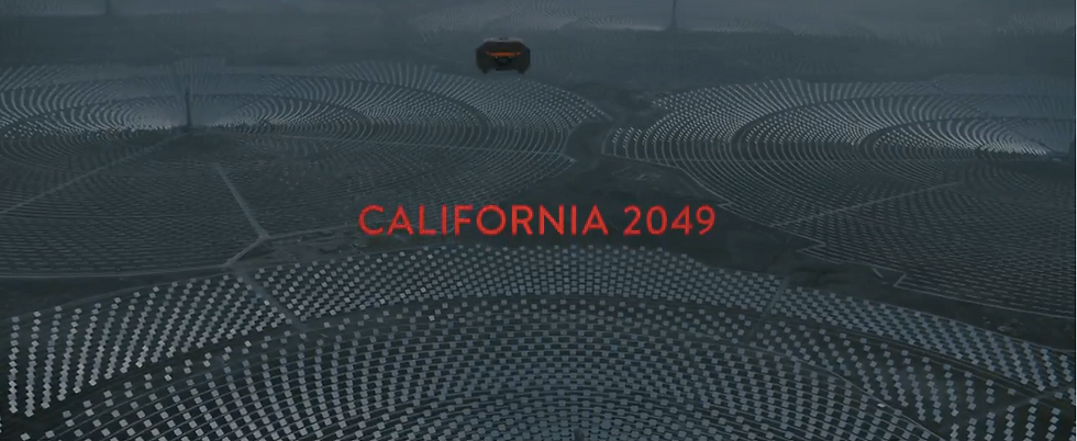
After this scene we see two different worlds, in original blade runner the progression of city and industrialisation is showing and in another film 2049 the challenges are different after industrialisation agro-farming is the challenge and now climate of the city totally changed full of pollution, which already started from industrialisation in Los angels (California in 2019), now it is in California 2049.

Los Angeles November 2019
Overall Production Design Review:
The basically the style, look and feel is the production design, so if the film is about it should be designed as the future. In pre-production of ‘Blade Runner’ which is directed by Ridley Scott, this was the first time ever pre-production of a future film took more than 9 and half months (even more than the creation of a life, pregnancy duration), that’s why everything came in this film with more perfection. Production Designer Lawrance G Paull had a team of very talented and experience people of that time in their field of expertise like David L Synder, Syn Mead, Tom Southwell and many others.
Lawrance G Paull fully focused on creating larger and collective canvas of set which had own rules, with art director David L Synder they used old buildings and then retro fills them with ducts, pipes, blocks and other use of materials to give them more future building or sets for the shoots. The architecture in film somewhere like Art Deco. In my view, the overall look, feel, mood and style of the Blade Runner (2049) is in one is Brutality. The architecture of the film is Brutalist, consisting of large simple geometric masses with features forming repeated geometric patterns. Even for the film I would like to mention this word ‘brut’ as Le Corbusier's ‘béton brut ‘, meaning “raw concrete in French”, I use this word because this film on production-design wise or making wise itself a raw concrete (not comparable). Directed by Danis Villenue and production designed by Dennis Gassner this film Blade Runner (2049) had sets which were totally functioning worlds. For this film most of things were made as real to give more real and aesthetic effect.
Many filmmakers design everything real for their shoot, every filmmakers has their distinct style. If you are a filmmaker or want to be a filmmaker, you should understand the basic production design. Many film schools charge lakhs of rupees to provide these knowledge, in ZoomMantra Insititute of Filmmaking we give you a crash course of 45 days and provide all the basic knowledge related to the filmmaking’s different departments, and we will assure you within 45 days we’ll provide you an assistance to make your own film.
For more details, Enquire now


Comments